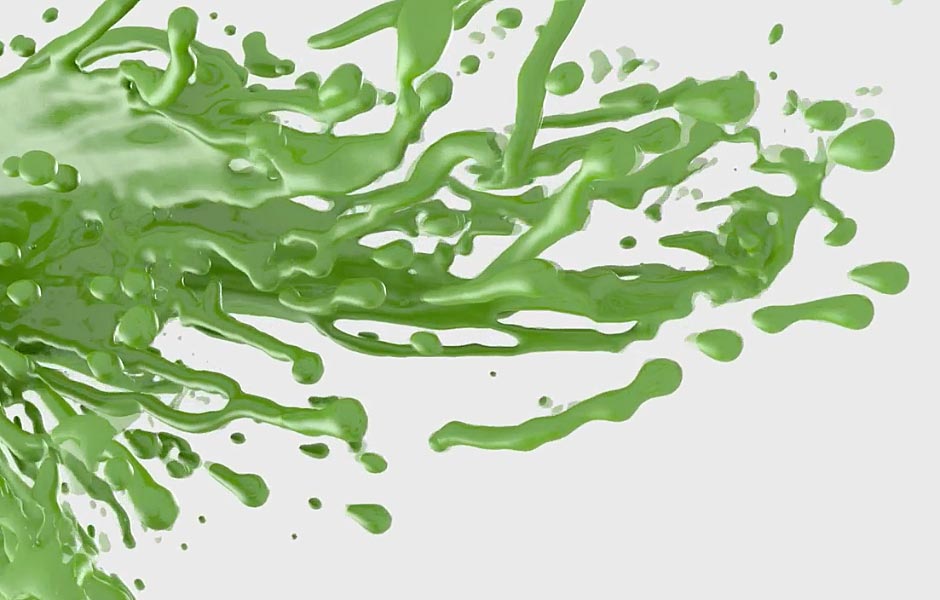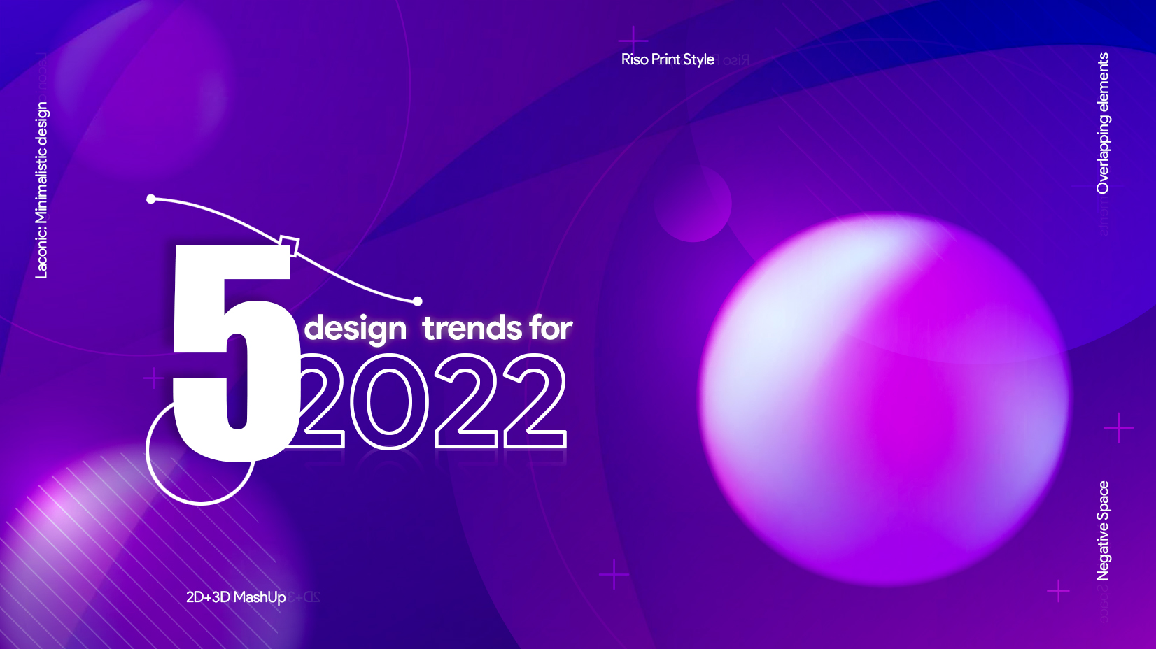
Designers worldwide are rooting for an expression rich drama steeped in curiosity and the dare to experiment when it comes to the best graphic outputs. Confined by corona and transformed by art, in this blog, we have highlighted 5 fanciful trends that will rock 2022 like it has never before.
1. 2D/3D Mashup

Hyper-realistic 3D visuals that blur the line between digital and physical to highly creative mashups with 2D and paper cut-out elements will steal the show in 2022. Psychedelic designs fuelled by disruptive communication and authentic personas will create statement art for international and regional brands. As the clamour shifts towards simplicity, expressing with clean, clear aesthetics will rule the narrative. Therefore, we are likely to see a switch from simple static to static that embraces hypothetical elements to bring to life a vibrancy that is intentional or pre-meditated. How inclined are you to embrace this shift?
2. Negative space

Creative use of white and black spaces enhances visual without complicating it; grabs attention and also leaves room for exploring more with less. Negative space forever remains our personal favourite when creating something inspiring yet minimalist. The scope is limitless when going with negative space. It can be elementals, typographic, ambient or character-specific. So dabble with negative space and limit the use of design elements to their minimum. Result – your designs will be more mature, to the point and evolved.
3. Overlapping Elements

Be notable and ingenious with images that look more voluminous. Overlapping can be applied to letters, colours, shapes, symbols and patterns; infact, anything as long as the contrast and significance are untampered with. Be careful of the saturation points and colour palette usage. You can try monochrome on monochrome or can go quirky colourful. Be bold and stand out without prejudice. Sometimes the best design work is the simplest one. Don’t fear criticism; embrace change with the way you approach design.
4. Laconic

Laconic is one of the best ways to stand out without saying much. It can be associated easily with the sarcastic, dark style humour for graphic design. Laconic style insinuates rhetoric which is why is it fun—the more open-ended your interpretation, the more niche your communication. However, the laconic style may not be the best bet for communicating brand objectives. Instead, go laconic if you have a story to tell. With laconic, you offer your viewers the pleasure of indulging in creative ideas in a minimalist way.
5. Riso Print style

Go retro. It’s bold, beautiful and always classic. Like fashion, graphic design is about trends that’s been there before. Revisit styles, reinvent ways of representation and you will have something grand to exhibit. Riso print simply stands for screen printing, now done digitally. The highlights of Riso are the vivid gaudy colours that scream popularity and attention as well as the texture of the work.
Honestly, it is a tad bit difficult to narrow down on the spectrum of our favourites when discussing graphic styles. Everything that renders meaning to a brand intelligently seems appropriate enough to become a raging talk here at Design Mechanics. We have many more favourites on our mood board than we could share here. If you want to see some ingenious work done for India’s crème-de la crème clients, ping us or drop us a mail. We will be thrilled to share our work and help you design yours.
Design Credit: Ajay Singh, Surbhi Virat, Kamlesh Kanwal, Ajay Negi, Anamika Gupta, Shruti Saxena